.jpg?t=1533315998368) How-To Articles
How-To Articles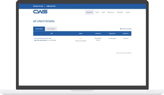 Support Portal
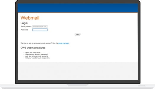 Webmail
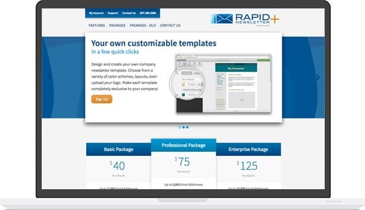 Rapid Newsletter+
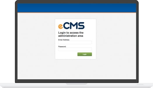 eCMS
eCMS

 In my last post I talked about "Is Flash the Solution?", this time I want to touch on the mobile web and how you can utilize it to your benefit.
In the last 5 years mobile internet usage has increased rapidly with the help of inexpensive mobile devices and more powerful networks. Personal Digital Assistant (PDA), are not the only mobile device that can access the internet, inexpensive smart phones now have the ability to browse the internet. Browsing speed has increased with 3G and 4G networks. Now much more information can be transferred.
With this surge in mobile browsing should you be looking into a mobile version of your website?
It depends on who is your audience and why they are using your website. Begin by researching your audience. If you find that you have mobile viewers you may want to look into optimizing your site for them.
Some options you have:
Do Nothing
You may not have to change anything on your site if the code is clean, structured and labeled correctly. If you keep your site light it will help with how long it takes to download pages. With clean code, higher end mobile devices will have no trouble rendering your site. Lower end devices are reliant on structured code with descriptive labels because they will remove all styling and will instead view the pages as plain text. While this can be the most inexpensive option for your site it is not truly optimized for mobile viewers.
Separate Style Sheet for Mobile Devices
Your next option allows you to add to your current website saving you a little time and money. Your website is brought to life by colors, textures and layout. These styles are applied to your website by a style sheet. You have the option to have multiple style sheets that are specific to what the viewer is using to browse your website. You will be able to structure the site specifically for mobile devices. This option will not increase your page download time because it is still downloading everything you see on a normal browser.
Separate Mobile Website
The last option is to build a separate website specifically for mobile users. Mobile viewers will have the best experience because the site is tailored with a mobile viewer in mind. Content can be condensed down to the bare minimum and place more important information and features toward the top. The page will load faster and navigation and usage will be easier because it is built for a mobile device. The down fall to this option is that you will have two websites to maintain instead of one.
Website owner may opt to go with one of the first two options of either "doing nothing" or "creating a separate style sheet" for mobile device. If your mobile audience is visiting your site for specific reasons such as viewing a calendar of events, needing to search your site or to view continually updated stats then a separate mobile site is probably the best choice.
Mobile is rushing at us at an exponential rate. By this time next year most sites will likely be viewed on mobile devices rather than computer screens. It is certainly an area to keep on top of if you want to effectively reach your audience.
 Our content team is made up of thought leaders, strategists, and content creators who have more than 70 years of combined experience. With a wide variety of backgrounds as entrepreneurs, marketing gurus, healthcare associates, as well as plenty of experience in other industries, we help grow businesses with our relevant, trusted, and helpful resources.