.jpg?t=1533315998368) How-To Articles
How-To Articles Support Portal
 Webmail
 Rapid Newsletter+
 eCMS
eCMS
When Mission 21 first approached CWS, Inc., we had no idea who they were or what they did. Obviously that was the first thing we needed to change. After Mission 21 unveiled their story and mission, our team was immediately awestruck by this local, non-profit organization.
Their mission: to provide resources and restoration services to child victims of sex trafficking. We assist victims of sexual exploitation so that they will be restored mentally and spiritually and re-enter society as survivors.
Immediately we wanted everyone to know and support Mission 21. Their biggest challenge was not having a consistent, professional, and flexible brand. Our first step was to redesign their logo.
Old Logo

Goals & Challenges
Their goals for the logo were clear:
-
Demonstrate a Legitimate Organization
-
Appeal to Youth Demographic
-
Flexibility for Marketing Materials and Mediums (Print vinyl, clothing, web, pendant, pin, temporary tattoo...to name a few)
Not only did logo need to serve several purposes, but it also needed to appeal to and inspire 3 different audiences to act:
Donors
Community supporters who need to establish trust with and encourage them to take their money and put it to good use
Educators
Professional service providers looking for these survivor-focused programs to refer their youth to
Youth
Survivors between 12-20 who are looking for help and/or a supportive community to help them deal with issues surrounding their experiences with sexual exploitation
Our Approach
After reviewing the goals, audiences, and additional information provided by the client, we completed a first round of logos. Did we hit it out of the park on the first try? Nope.
As with most logo redesign processes, Mission 21 became inspired by the first round of logos and provided us with a plethora of additional feedback. To name a few:
- Like recognition attached to a heart icon
- Need a standalone symbol to become an emblem
- Want some Pop art, youth feel but still professional
- Use blue and orange: Blue is child abuse prevention, orange is freedom
- Symbol should be flexible in other colors
With each piece of feedback, our team immersed themselves in the survivor and educator mentality. When Mission 21 was presented with the final round, it was love at first sight.
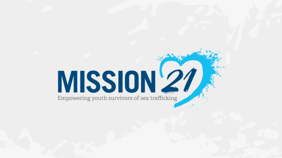
The final round produced Mission 21’s new logo:
Comparing Old to New

Goal 1 Results: Demonstrate a Legitimate Organization
272 Referral Sessions
following the first 90 days of displaying the logo on the new website
523 Referral Sessions
following the first 6 months of displaying the logo on the new website
50 keywords ranking on 1st page
including Top #1 rank for “Mission 21”
627 visits to donate page
following the first 90 days of displaying the logo on the new website
1,285 visits to donate page
following the first 6 months of displaying the logo on the new website
1524 website sessions, 78% of those are new visitors
following the first 90 days of displaying the logo on the new website
Goal 2 & 3 Results: Appeal to Youth Demographic & Flexibility for Marketing Materials

The Impact Factor
 "As a small non profit, trying to do the most good with what we have, first impressions matter. CWS far exceeded our expectations with rebranding our organization. We are a professional, welcoming and innovative youth organization serving victims of sex trafficking and our new logo reflects our heart, culture, and history. Thanks CWS!"
- Stephanie Holt, Founder of Mission 21
The overall impact factor? A powerful logo and brand that speaks to the community and establishes Mission 21 has inspirational and dedicated team to fight human sex-trafficking.
 Emily is the head Content Creator. She enjoys communicating complex ideas in an easy-to-understand way.