.jpg?t=1533315998368) How-To Articles
How-To Articles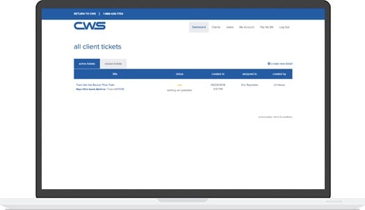 Support Portal
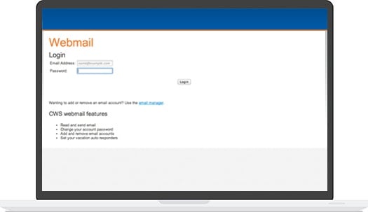 Webmail
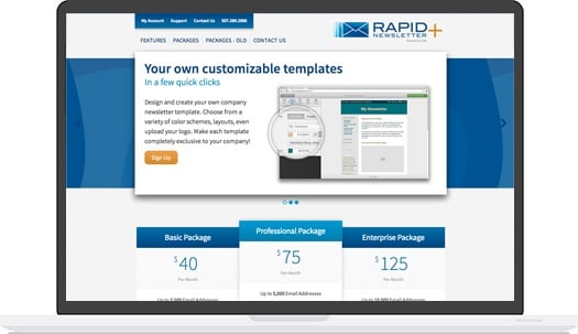 Rapid Newsletter+
 eCMS
eCMS

Mobile devices are in the pockets of 95 percent of Americans, and 10 percent rely on smartphones and tablets as their primary Internet connection. Your mobile applications need a functional layout that improves the user experience and encourages your audience to engage with it. Here are some of the best mobile app layouts out there, as well as what makes them great.
1. AIRBNB
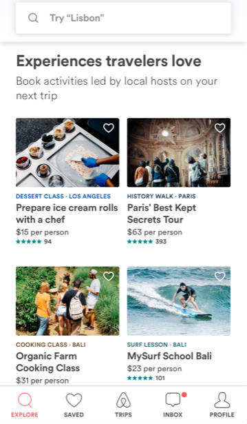
Airbnb's business model lives and dies by its web experience, so it's no surprise that the mobile app has a lot to offer. The overall look and feel of the app is consistent with the website, so users can seamlessly go from mobile to web without any cognitive dissonance.
You can easily search for places to rent or local experiences, as well as other content that Airbnb offers. It's a visual-centric interface that makes it accessible to users across the world. After you book a place, you can quickly communicate with the hosts if you have any questions or concerns.
2. WAZE
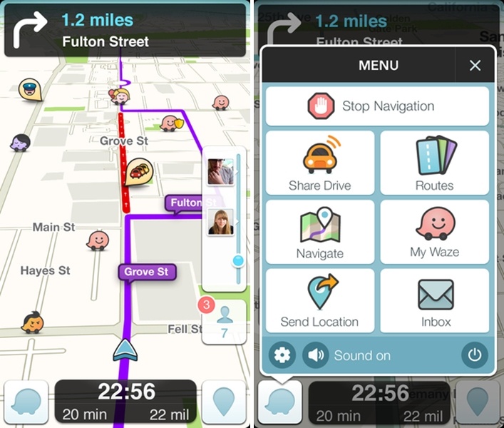
Waze is a crowdsourced GPS that offers an excellent navigation system when you're driving around. This mobile app's biggest challenge was the environment that most users access the app. They're focused on driving so everything needs to be easy to read and understand. Waze relies heavily on clear visuals, symbols and simple input to make it safe to use.
3. MINT
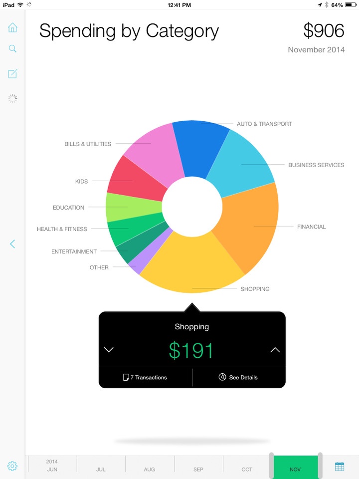
Mint is a budgeting app that offers an excellent personal finance tool for its user base. Since money matters can be complicated to understand, this mobile app needed to simplify complex concepts. It relies on data visualization to give users a better idea of what their finances look like.
You have several ways that you can examine the information to determine whether you're meeting your budgeting goals. A broad overview provides the top-down look, while drilling-down into the data provides better insight into the finances.
Mint also provides personalized recommendations on how to save more money, which allows it to act as a guide to users. Its use of colors is particularly well-done. When you stay on budget, the bars show up as green. If you're getting close to the top-end of your budget, it's yellow. When you go over, the red makes it apparent that something is going wrong.
Everyone is familiar with the red yellow green system, so it's a smart design decision that leads to better engagement.
4. PACKR
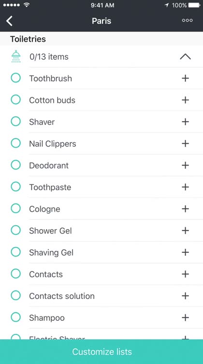
This mobile application helps users come up with a travel packing list that's completely tailored to their upcoming trip. They input information, such as the type of transportation, planned activities and accommodation style, to get a personalized packing list.
The simple user interface makes it possible to present a lot of options on the screen at once. Users reference Packr frequently throughout the packing process, so this app needed an accessible way to display information.
5. TODOIST
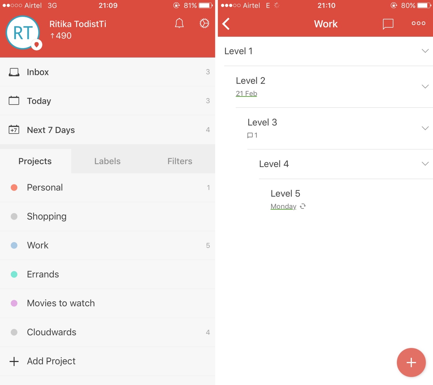
This to-do app doesn't clutter up the interface with a lot of unnecessary bells and whistles. You get exactly what you need to track everything you need to get done, and it uses bold colors to keep users engaged and interested. Try to focus on the most important functionality rather than letting your app get bogged down with "nice to haves."
Are you ready to put out a mobile application with a beautiful and functional UI? Use these examples as your inspiration and make something that's perfect for your user base.