.jpg?t=1533315998368) How-To Articles
How-To Articles Support Portal
 Webmail
 Rapid Newsletter+
 eCMS
eCMS

I don’t have to tell you how important it is to have a mobile-optimized website. That boat sailed years ago. Everyone drank the Kool-Aid in order to avoid Google’s “Mobilegeddon” this past April. Here’s the problem. Everyone was so focused on quickly launching a mobile site to appease the almighty Google “Mobile-Friendly Test” that functionality and user experience was overlooked. Since Mobilegeddon, businesses have actually experienced a drop in conversions from their mobile customers.
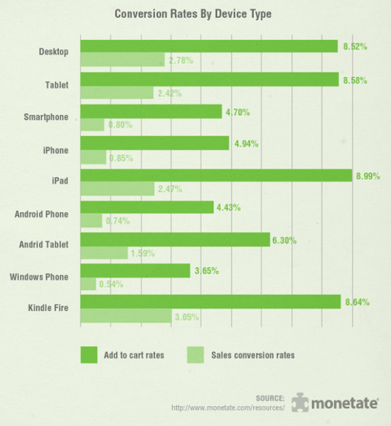
Check out this conversion rate chart from Monetate Q4 2014 Ecommerce Quarterly. Notice that the conversion rate for Desktop is double the rate for Smartphone.
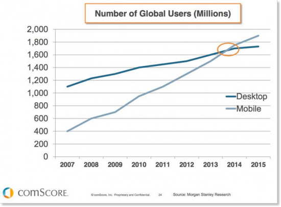
As you may have already guessed, the number of people using smartphones to make purchases, set up appointments, or request quotes is steadily increasing. In fact, according to this report by comScore, the number of mobile users has now surpassed the number of desktop users.
So why are the conversion rates for mobile still lagging behind desktop?
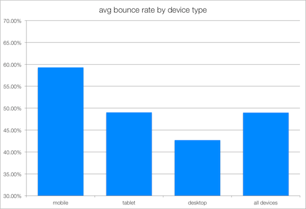
One possibility is that your mobile website does not get the job done. People arrive at your mobile site, and then a combination of variables puts them off, leading to high bounce rates. Bounce rates for mobile sites are generally higher than desktop as shown in the graph below.
If you review your website analytics and notice that there is a high bounce rate and a low conversion rate from your mobile audience, you need to address this problem immediately. Here are seven ways that your mobile site may be harming your business instead of helping.
1) Load time is too long
Depending on how your mobile website was built and optimized, the time it takes to load your website can be considerably long. Sure, you might think the load time is fine, but then again, you have a different level of investment than your audience.
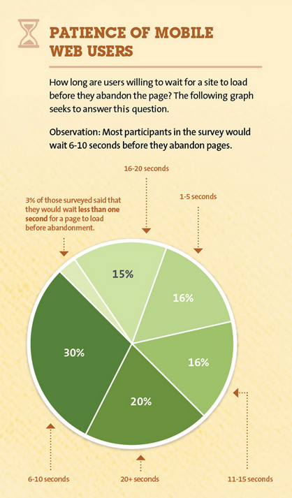
According to a study done by Kissmetrics, most participants were only willing to wait 6–10 seconds for a site to load on their phone before abandoning the site.
Test your mobile site. What features cause pages to load slowly? If it’s possible to speed up the user flow, put in the work and $$ to do so. A word of caution: Don’t simply remove all of the features that weigh down your mobile site. If these features create value for your audience, find other ways to improve the site without discarding them.
2) Your mobile website does not have a responsive design
There is a huge difference between a separate mobile site and a responsive mobile design. If you haven’t been beaten over the head with this concept yet, here it is. Responsive design means your website dynamically adapts to fit the screen on which it’s viewed. In other words, your mobile site looks and works consistently with the desktop version because it is the desktop version.

This is the absolute best way to create harmony between the two devices from the standpoints of both the developer and the user. Your mobile audience should not have to lose out on features that are only available on the desktop version. Mobile searches have surpassed desktop searches, so why would you not want the mobile variation to be consistent with its desktop counterpart?
3) Click to Call and Contact are not prominently displayed
Many mobile websites do not have click-to-call buttons. Even worse, the contact info is either on a contact page only or in the footer at the bottom of the page. Your mobile site is an ultimate tease, providing good information but no easy way for would-be customers to make contact.

Check that there is a clear click-to-call button or contact information is at the top of each page of your mobile website. This small adjustment will make a huge difference now that your mobile audience can actually—well—call you.
4) Design is not “fat finger friendly”
Have you ever tried to press a link and it either doesn’t activate or you accidentally click on an adjacent link? This process not only adds more time to the user experience, but it also adds frustration. If your users are not able to click through pages and links seamlessly, they are more apt to exit your site.
Test your mobile site for “fat finger friendliness.” Check with multiple staff members to ensure that everyone finds it easy to click links on your site. Remember, the slightest frustration may send that mobile user off your site and onto your competitor’s.
Sign up for our FREE webinar "Website Redesigns Are Dead... Do This Instead!"
5) There are no clear calls-to-action
If your mobile website experiences very few conversions, you may want to look at your calls-to-action (CTAs). Does each page provide the user with an action to take? A CTA usually comes in the form of a button or form to fill out. Here are some common examples of CTA verbiage:
- Click here
- Learn more
- Fill out
- Download this
- Apply now
- Request a quote
- Schedule an appointment
- Ask our
- Watch this
- Read about
All of these CTAs allow for the user to interact with the website. As the user scrolls through the mobile version, make sure that there is ample opportunity for activating a CTA. This brings the user closer to becoming a customer. This also allows return visitors to quickly get to those CTAs without spending unnecessary search time.
6) Forms have not adapted properly to mobile
When a mobile site does not have a proper responsive design, forms can turn out a bit “funky.” Form fields might get shifted off screen or be difficult to enter information in. In some cases, the form may not work at all.
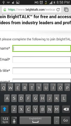
Forms are great for taking the user to “lead” status. When the user fills out a form, you’ve been given permission via their contact information to reach out and assist them with your products or services. Be sure that this great tool has adapted properly to your mobile site so that the process of filling out the form is easy.
7) Non-existent map and direction features
If your business requires or wants foot traffic, consider adding a map feature to your mobile site. Most people use their phone as their GPS because of how quick and easy it is to find a location and pull up directions. When this feature is absent from your site, you force your audience to take extra time to select your address, copy it, open their Maps app, open a new search, paste in the address, and then wait for the directions to load.
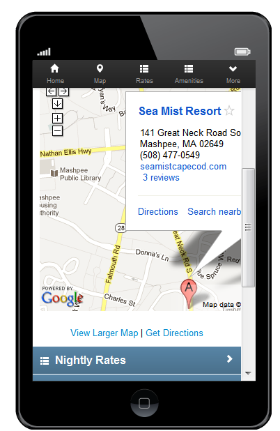
Rather than test the patience of your mobile users, place a map/direction feature that connects to their Maps app and creates a convenient experience.
Final Thoughts
The best way to evaluate your mobile site is to go to other mobile sites. What makes the site easy to use? What makes you want to purchase something or use the services listed? Better yet, what parts of the site make you cringe and exit?
One last tip: Consumers and technology are always evolving. Do your business a favor and keep up with what consumers look for when searching for products and services. Research how they use devices. Analyze how your desktop and mobile sites perform and change or update as needed. You’ll find that you not only have higher conversion rates, but you have higher client retention.

 Alex Slack is a Project Manager and Content Creator. Her magic formula for marketing success is summarized by the 3Cs: communication, creativity, and care. She will help manage your project from the initial brainstorm session, to the height of your campaign and beyond. Let Alex guide you and help simplify this crazy world of digital marketing!