.jpg?t=1533315998368) How-To Articles
How-To Articles Support Portal
 Webmail
 Rapid Newsletter+
 eCMS
eCMS
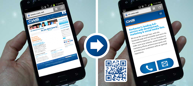
I was out to dinner one night with friends and we had a half hour wait to be seated. Rather than be a good, sociable friend, I picked up a newspaper and started reading. Several ads had QR codes to their website, so I began scanning them with my phone.
As I scanned, I realized a pattern….they kept taking me to the full website! Finally I found one that redirected me to their mobile website. Rather than tiny text and fuzzy images, it had readable text, prominent buttons, and the clear call to action that's needed on a smart phone.
In these days of tablets, smart phones, and other mobile devices, companies are finally starting to realize desktop websites don't cut it anymore.
Why do I need a mobile site? I've got a website.
Yes, you’ve got a website and it’s probably beautiful, but if it’s not optimized for mobile devices, it’s just a bunch of useless, fuzzy pictures and tiny text. And remember, if your website has any Flash features, they will NOT work on an iPhone or an iPad.
We're not just talking about a few people visiting websites with their phone. According to Hubspot, mobile internet users are expected to increase another 17% this year. Apple alone is expected to sell over 200 million iPhone 5’s. That's potentially a lot of traffic while people are waiting for their dinner reservations.
You’ve only got 5 seconds
Patience is a virtue today's internet surfer does not have. The name of the game with mobile sites is; Keep It Simple. If your mobile site takes more than 5 seconds to load, you can say good bye to 74% of your visitors.
Because users want web information differently from a mobile device than a computer, your mobile site should only contain the main features and content, prioritized according to the user’s needs (Smashing Magazine). Too many choices, buttons, links, and options can lead to no choice at all. Your user will give up and start playing Angry Birds instead.
Test it for yourself and win a $100 gift card
Alright. Fine. You’re one of those “seeing is believing” people? We challenge you to test it for yourself....
Here’s your challenge
*Update: Chad Johnson is our winner of the $100 gift card!
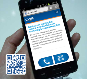
1. Go to cws.net in the mobile browser on your phone
2. Send an email to CWS from the mobile site
*We’ll know if you sent it from the mobile site so no cheating ; )
3. Enter your Name and Address in the email
4. Click Send!
We'll enter you in a drawing and the winner will get a $100 gift card to Kwik Trip! While you’re at our mobile site, make sure to click “View Full Website” at the bottom so you can see the difference on your mobile device!
P.S. If you're wondering about optimizing your website for mobile devices, send us an email with a link to your site. We'll shoot you back an email and suggest which areas you should and shouldn't have on your mobile version and the time and cost estimate to make it mobile friendly. Send the email to: jyucuis@cws.net